
I know I’m late, but I have finally been toying with the new CSS 3 display modes like flex and I’m already running into trouble.
It seems there are a lot of inconsistencies across browsers which makes me wonder if it’s ready to be used.
This little example renders differently with Chrome, Firefox and Internet Explorer. The container div’s display is set to flex and it is on purpose too small to display the items which should, since flex-shrink is non zero, be reduced to fit the container.
As seen below, there is no problem when the items are simple div elements. But turn them into images, and here are the results:
Chrome: as expected (as I expected at least), the img tags found into the flex container are equally shrinked to fit the container. 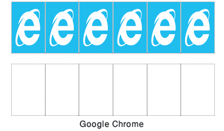
Firefox: unlike the div elements, images are not shrinked at all but the ratio is maintained. 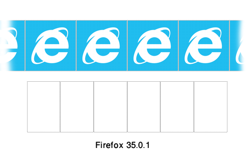
Internet Explorer it gets even worse with IE: aspect ratio is lost, and of course elements aren’t shrinked either. 
I haven’t listed Safari here but results are similar to Chrome although for some odd reason Apple’s browser still requires -webkit- prefix to work.
- Is display flex supposed to work with images tags?
- Are these inconsistencies due to the spec not ready yet? (this would explain why Apple’s Safari still needs the prefix)
When I heard about flex and started reading documentation about it, this new display type really seemed to be the display to use but after some experiments, I’m not sure it’s the way to go.
Worse, I feel like using table would be easier… Are we travelling back to 2005?